
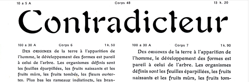
A vintage typographic specimen sheet showing the word “Contradicteur” in a large decorative serif typeface at the top, surrounded by size and style annotations. Below it are two columns of smaller French sample text, each labelled with typographic measurements such as “Corps 6” and “Corps 7.” The sheet displays variations in type size, spacing, and style for comparison.

Lubalin Lecture Series: “In vain!” Selling Auriol as a text typeface

Date: 12 October 2026
Time: 5:30 pm – 7:30 pm
Online
Third-party event
A vintage typographic specimen sheet showing the word “Contradicteur” in a large decorative serif typeface at the top, surrounded by size and style annotations. Below it are two columns of smaller French sample text, each labelled with typographic measurements such as “Corps 6” and “Corps 7.” The sheet displays variations in type size, spacing, and style for comparison.

Typefaces are often categorised as either “display types” (attention-grabbing designs made for short bursts of text, often large) or “text types” (unobtrusive designs in small point sizes that are comfortable for longer reads).

In the early twentieth century, the Parisian typefoundry Peignot et Fils released the Auriol family. With its blobby and disconnected shapes, Auriol rightly came to be celebrated as the premier Art Nouveau display type. What has been forgotten is that Peignot also cast, showed, and sold Auriol fonts as text faces.

This talk by Craig Eliason examines the development and publicising of the Auriol family, arguing that its promotion as a text face, while not commercially successful, was remarkably innovative.

[Tickets for this event are free. Please register to attend.]