
15 October 2026 (1pm BST)

This content is limited for members only
Within our member-only pages we provide a wide range of useful information resources including:- Recordings of our talks
- Presentations
- Academic research papers
- Case studies
- Guidance on standards and good practice
- Project opportunities
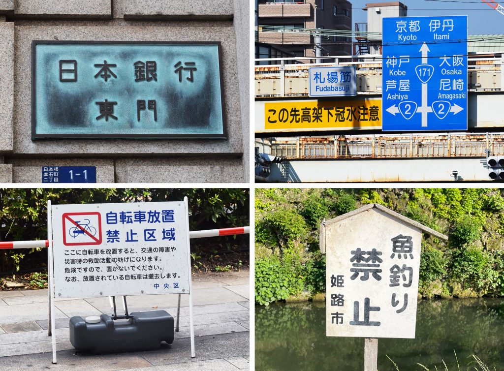
The seminar explored the distinctive role of rounded sans typefaces in Japan, where they have long been used to convey authority in public settings such as banks, courts, police stations, and official signage. Shoko Mugikura traced the historical and cultural development of this typographic tradition, examining the influences of calligraphy, sign painting, and multi-script typography that led rounded sans to become the preferred voice of public communication in Japan.
About the speaker
Shoko Mugikura is a Japanese typographer and type designer based in Germany. She studied Visual Communication Design at Musashino Art University in Tokyo and completed an MA in Book Design at the University of Reading, UK. After working in editorial and information design in London, she joined Just Another Foundry, the type design studio she runs with Tim Ahrens. Recent projects include custom typefaces for Funke Mediengruppe, one of Germany’s largest newspaper publishers. Alongside her design practice, Shoko writes and researches design and typography, with a particular interest in multi-script typography and the relationship between Japanese and Latin writing systems. Shoko has served as a jury member for TDC New York and TDC Tokyo, spoken internationally at events including ATypI, TYPO Berlin and TypeTalks Tokyo, and taught typography and multi-script design in Germany.