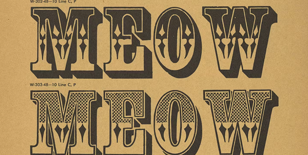
Most designers—and before them, printers—have looked at type specimen books. They have looked at typefaces to see how beautiful (or ugly) their letters are. And they have looked at typefaces set in a mass to see how legible they are. But they have not read type specimen books. They have not read the words, phrases, and paragraphs. This talk by Paul Shaw will closely examine the texts that typefounders used to display and promote their typefaces. Those texts have varied greatly, both over time and from typefounder to typefounder. Eighteenth-century typefounders, following the examples of William Caslon, relied on Cicero’s First Speech against Catiline to show off their text types. Even when Fat Faces, Egyptians, and Grotesques emerged as display types in the early 1800s, they continued to use “Quousque tandem abutere”. But as the nineteenth century wore on, typefounders began to include quotations from literary and historical works, proverbs and maxims, patriotic references, verbal hijinks and humorous wordplay, and just plain random combinations of words.
Investigating these texts can help to accurately date specimens and typefaces, identify connections among foundries, reveal the political sympathies of typefounders, and shed light on the social and economic circumstances of the times. There are other texts in type specimens beyond the texts that showcase the typefaces: introductions, price lists, advertisements for ink makers and others, and the typographic apparatus of headers, titles, captions, and credits.